The Atlas brand.
Logos, colors, and typography for press, partners, and creators using the Atlas name. Use them well.
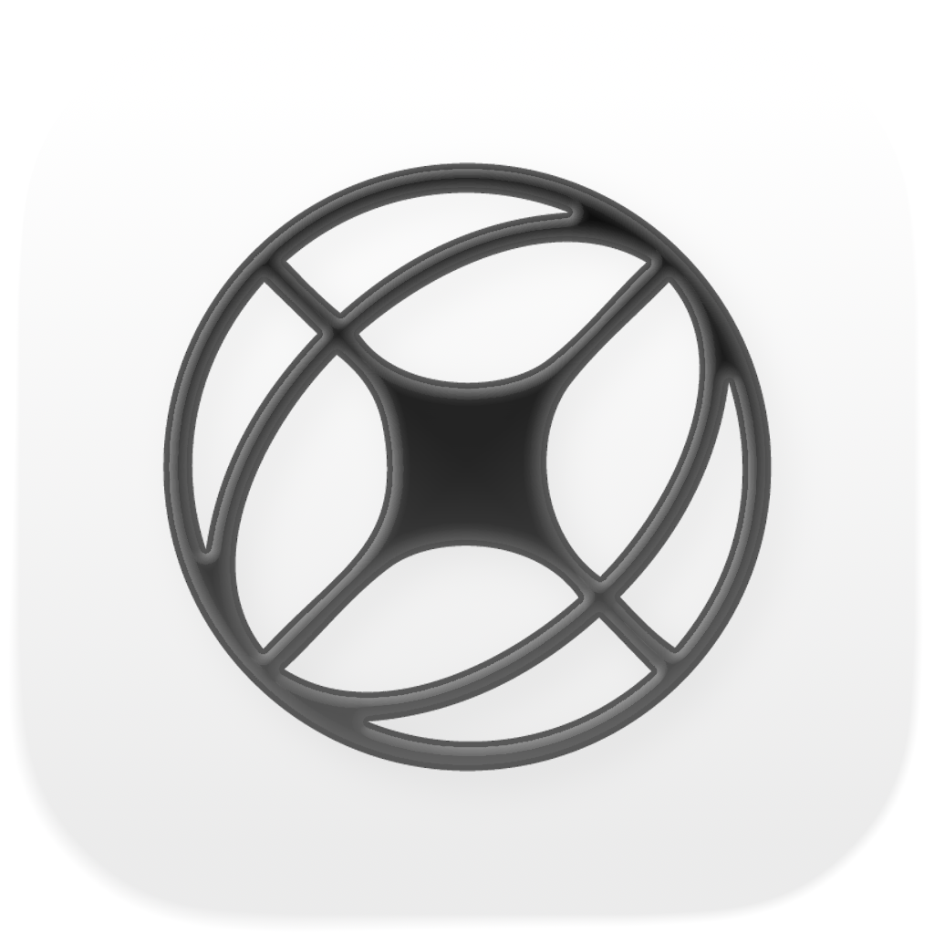
Marks & lockups.
Pick the one that reads cleanest on your background and don't redraw it from memory.


The palette.
One accent. A near-black for text, a near-white for paper. Use color sparingly and let it earn its place.
Accent Ink
#0a0a0a
The accent. Reserved for emphasis, CTAs, and active states.
Accent Hover
#2a2a2a
Pressed and hover state for the accent.
Ink
#111827
Primary text on light backgrounds.
Stage
#0a0a0a
Dark surfaces and the agency-side palette.
Mute
#525866
Secondary text. Captions, metadata, descriptions.
Paper
#f4f6f9
Default surface. The page reads on this, not pure white.
Edge
#d4d4d8
Card borders and dividers on the light side.
Edge Dark
#2a2a2a
Card borders and dividers on the dark side.
Three voices.
One typeface for the mark, one for the headlines, one for the words. Don't mix them up.
Do's & don'ts.
Short list. The brand stays consistent because we hold these lines.
- Use the logo on a contrasting background — light marks on dark, dark marks on light.
- Keep clear space around the logo equal to half its height on every side.
- Capitalize "Atlas" — it's a proper noun, not "atlas" or "ATLAS."
- Pair Mona Sans for headlines with Inter for body copy. They're tuned to work together.
- Reach out to press@atlassocialapp.com for editorial or partnership use.
- Don't stretch, skew, rotate, or recolor the logo. Use the file we provide.
- Don't add drop shadows, glows, gradients, or strokes to the mark.
- Don't place the logo on a busy photo without a solid backdrop or sufficient contrast.
- Don't substitute a different typeface — Druk Wide, Mona Sans, and Inter are the only three.
- Don't redraw the logo by hand or trace it from a screenshot. Ask us for the file.